Characterized as passionate and knowledgeable, WATSON's goal is to obtain efficient and sustainable resolutions.
In preparation for the launch of the new firm, WATSON chose CASCO to develop a brand identity.
The mark, which bears the founder's name, puts a visual emphasis on the 'O'. When seeing the 'gap' as a 'split', this symbolizes fairness and equality in separations. The 'facing' sides of the 'O' also symbolizes two parties pursuing a fair resolution.
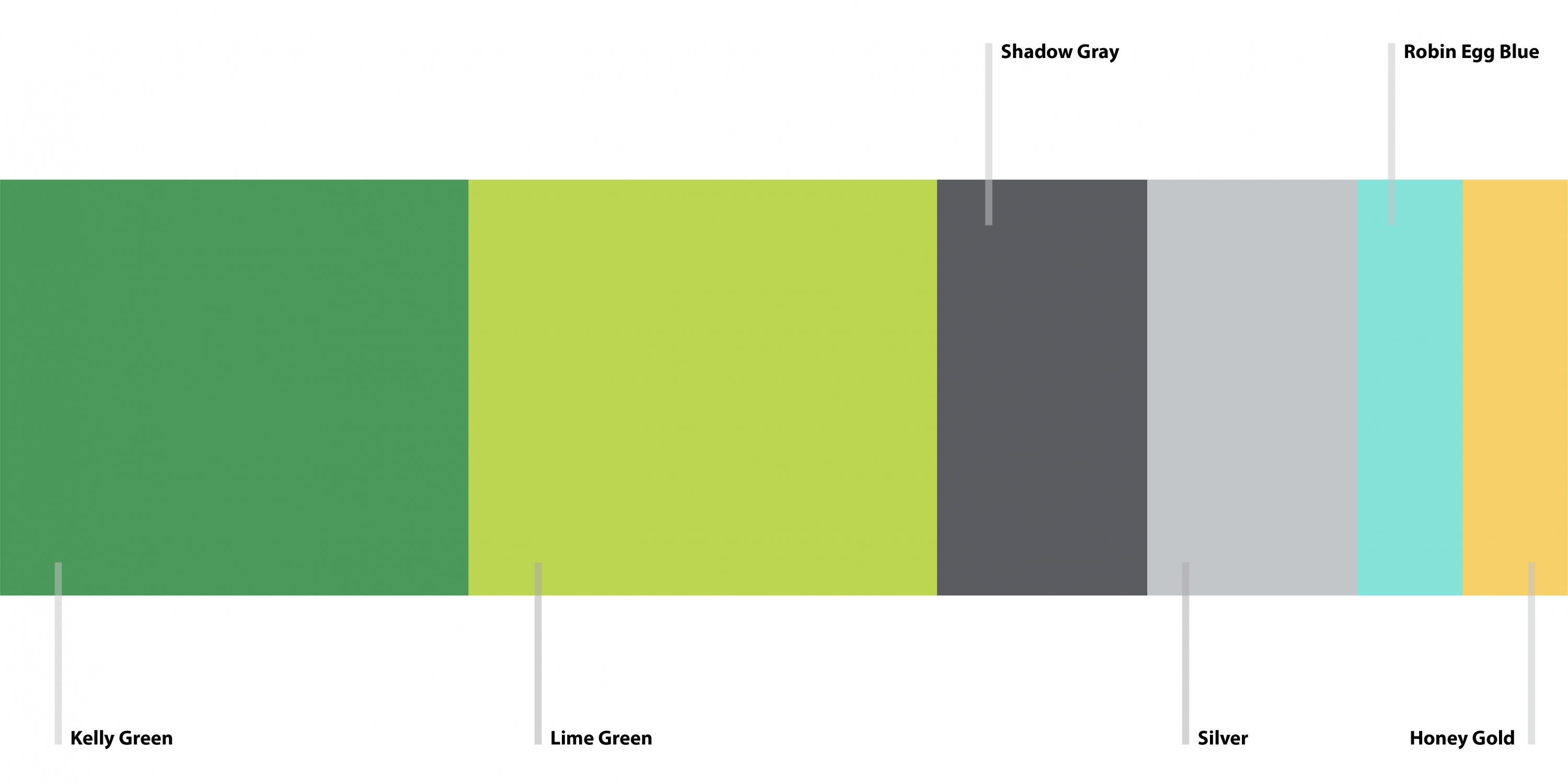
CASCO selected the Avenir font for its clean and uniform makeup. Slightly customized to add uniqueness to the mark, the use of capital letters speaks to the experience and confidence one can expect of the firm's team. Kelly green, complemented by a lime green helps express new beginnings.
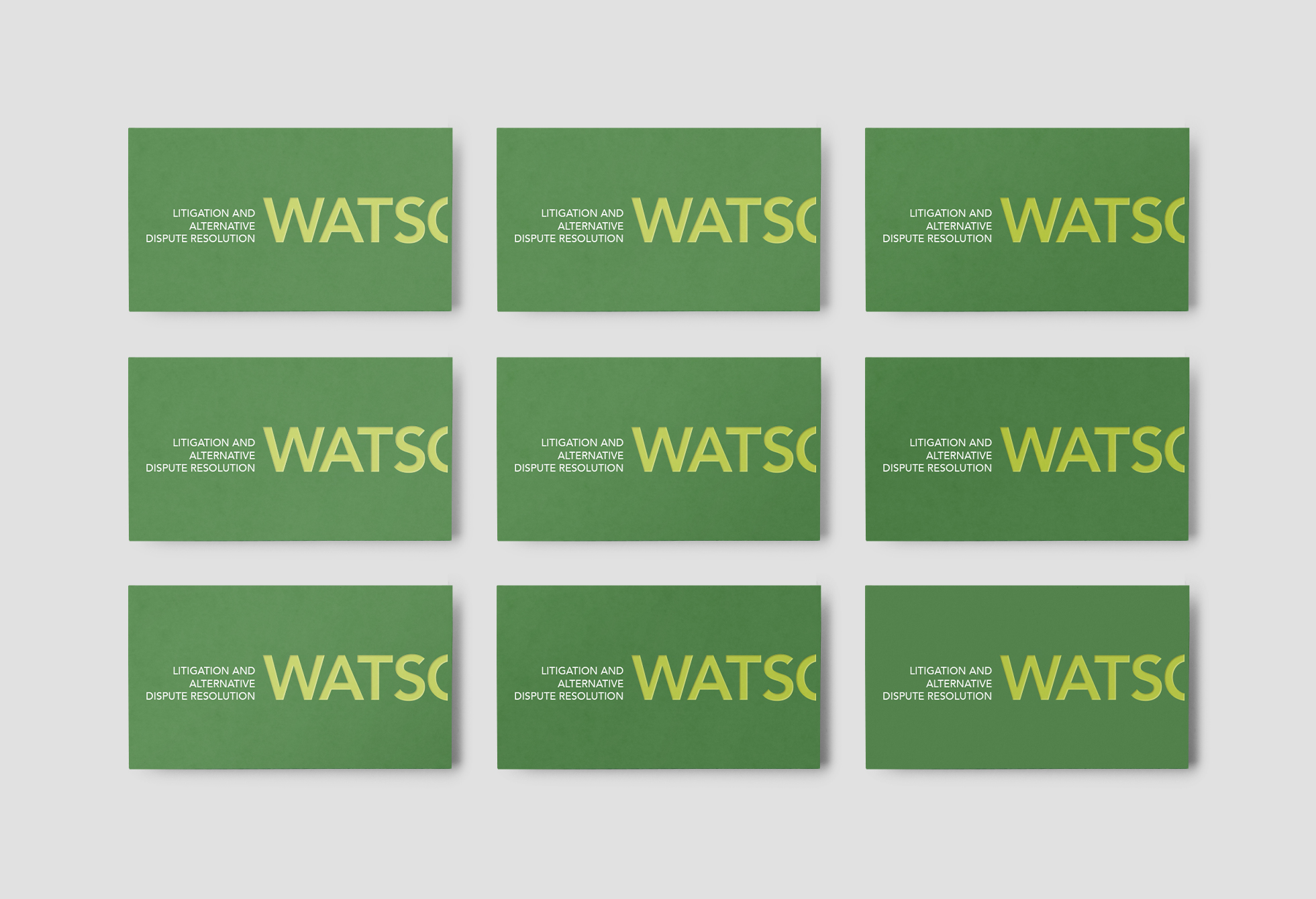
The stationery set features a playful placement of the 'split' mark reinforcing a message of fair representation cognizant of the opposing party. Rich in texture, the business card features a foil stamp placed on a debossed mark makes for a great first impression.
CASCO designed environmental graphics, leveraging the wall space in a tridimensional way. Custom Pantone colours to match the colour palette were also used on a ‘tone-on-tone’ acrylic wall-mount sign, giving the space a welcoming yet confident look. Beautiful Knoll furniture brings the space to a new level.
We also planned, designed and developed a new website for the firm.
Visit Watson's website.
Read Less


