In today's competitive landscape, leveraging technology is vital for maintaining a competitive edge. This philosophy is deeply ingrained in Asymmetric's core values. Recognizing the significance of this insight, CASCO took on the task of developing a brand strategy to position the company by highlighting how embracing one's differences can serve as a competitive advantage.
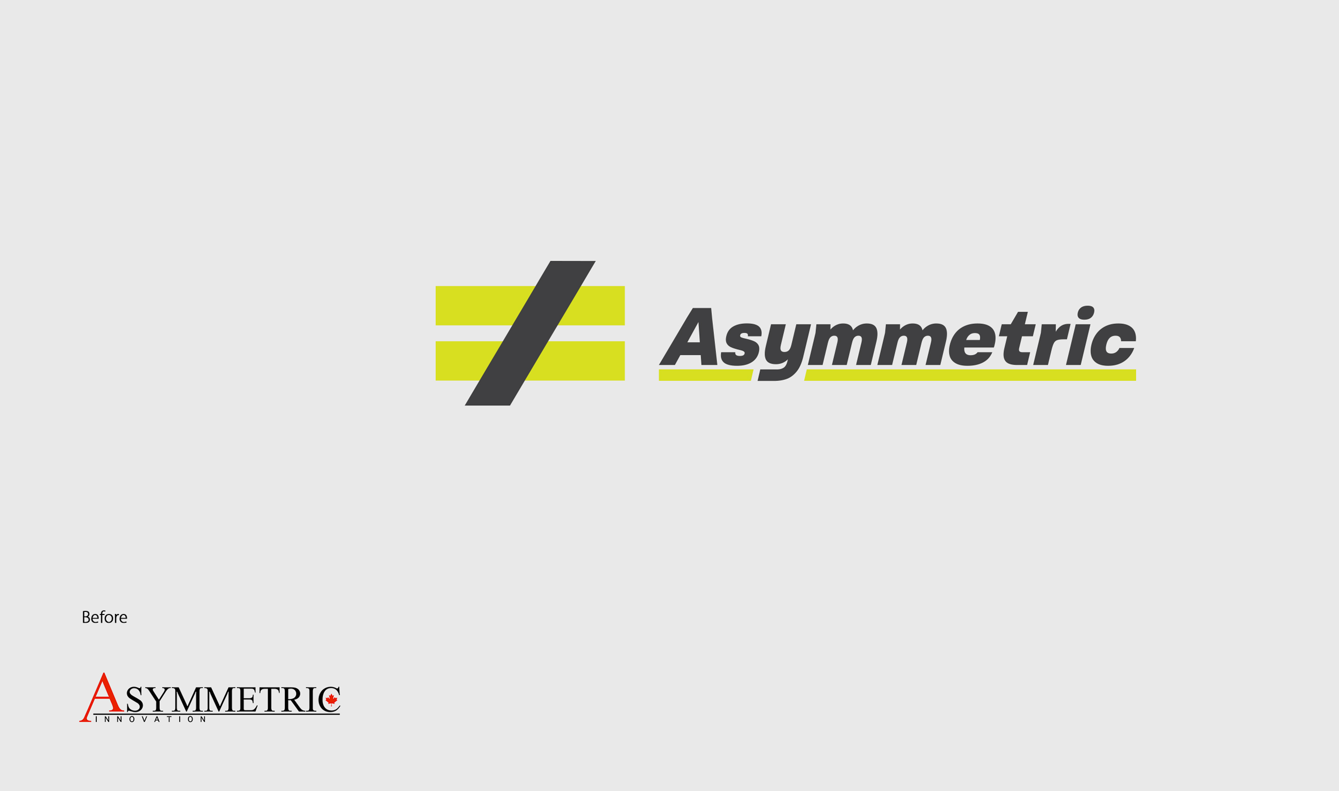
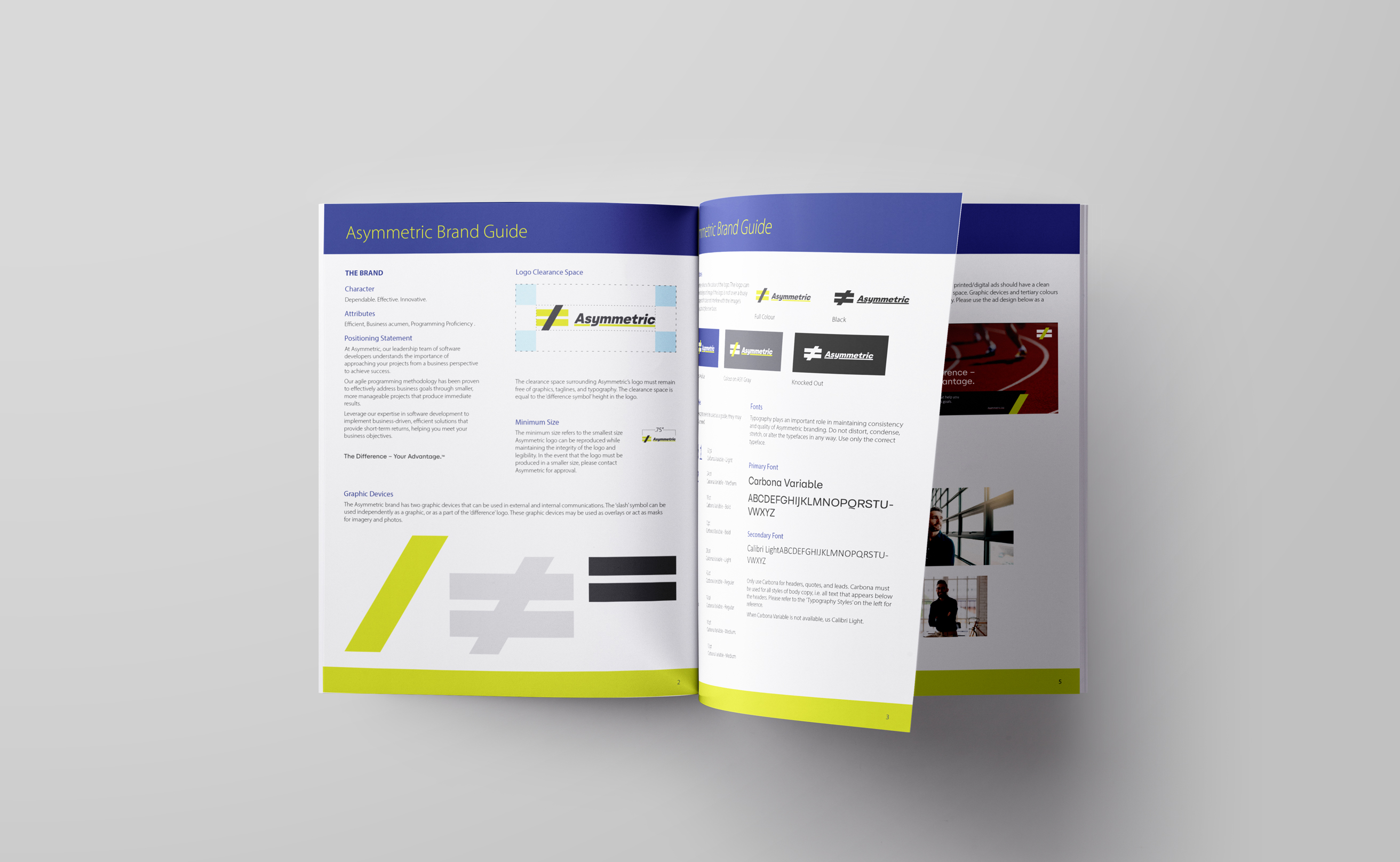
Inspired by the concept of the company's name, we explored effective methods to communicate what sets Asymmetric apart. During our exploration, we rediscovered the 'difference' symbol, which also symbolizes equality. The 'slash' symbol represents the ascending stem of the uppercase letter A, adding further significance to the custom mark. By emphasizing differentiation as a strength, we created a platform that showcases the distinctive elements that set Asymmetric apart from its competitors.
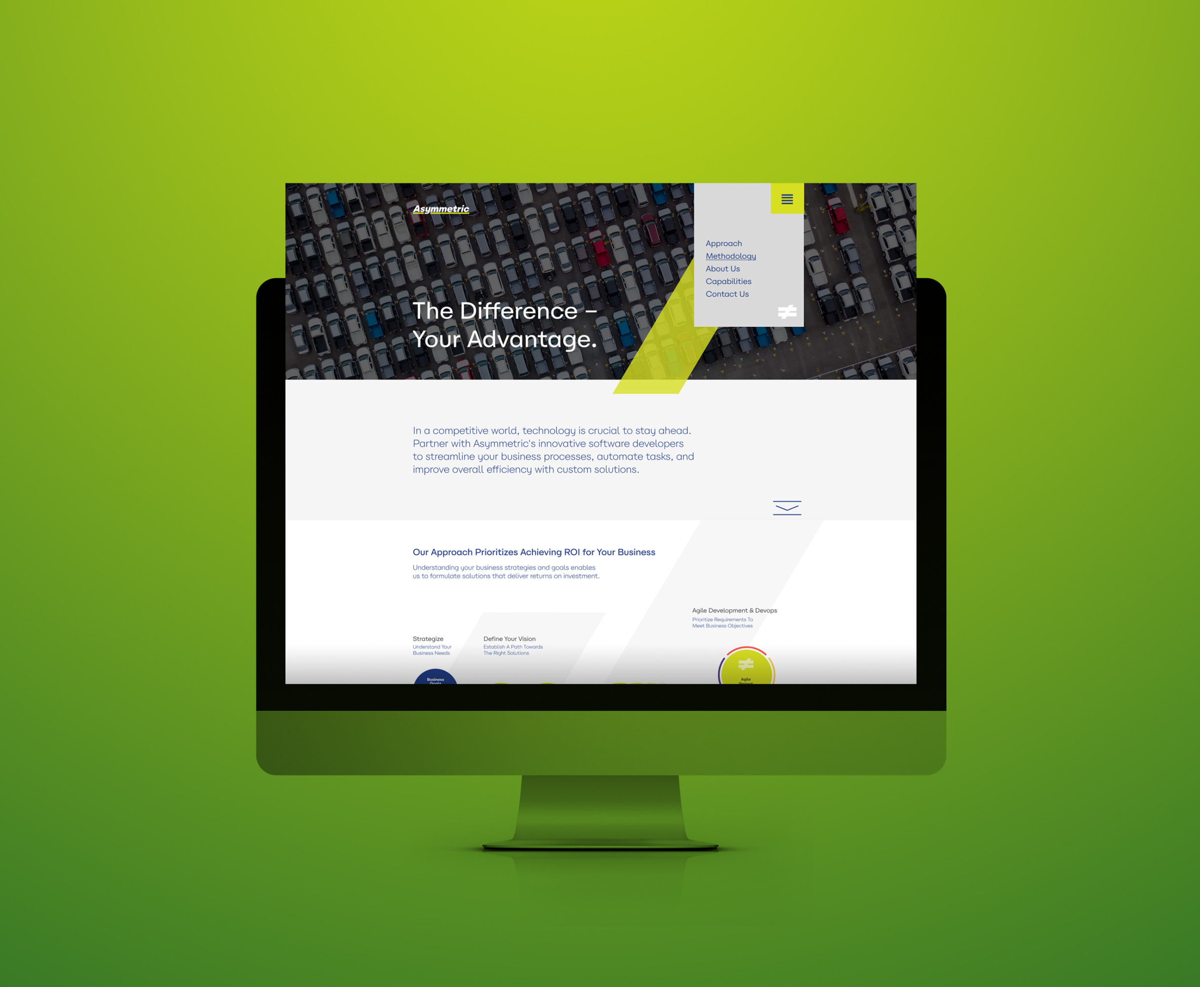
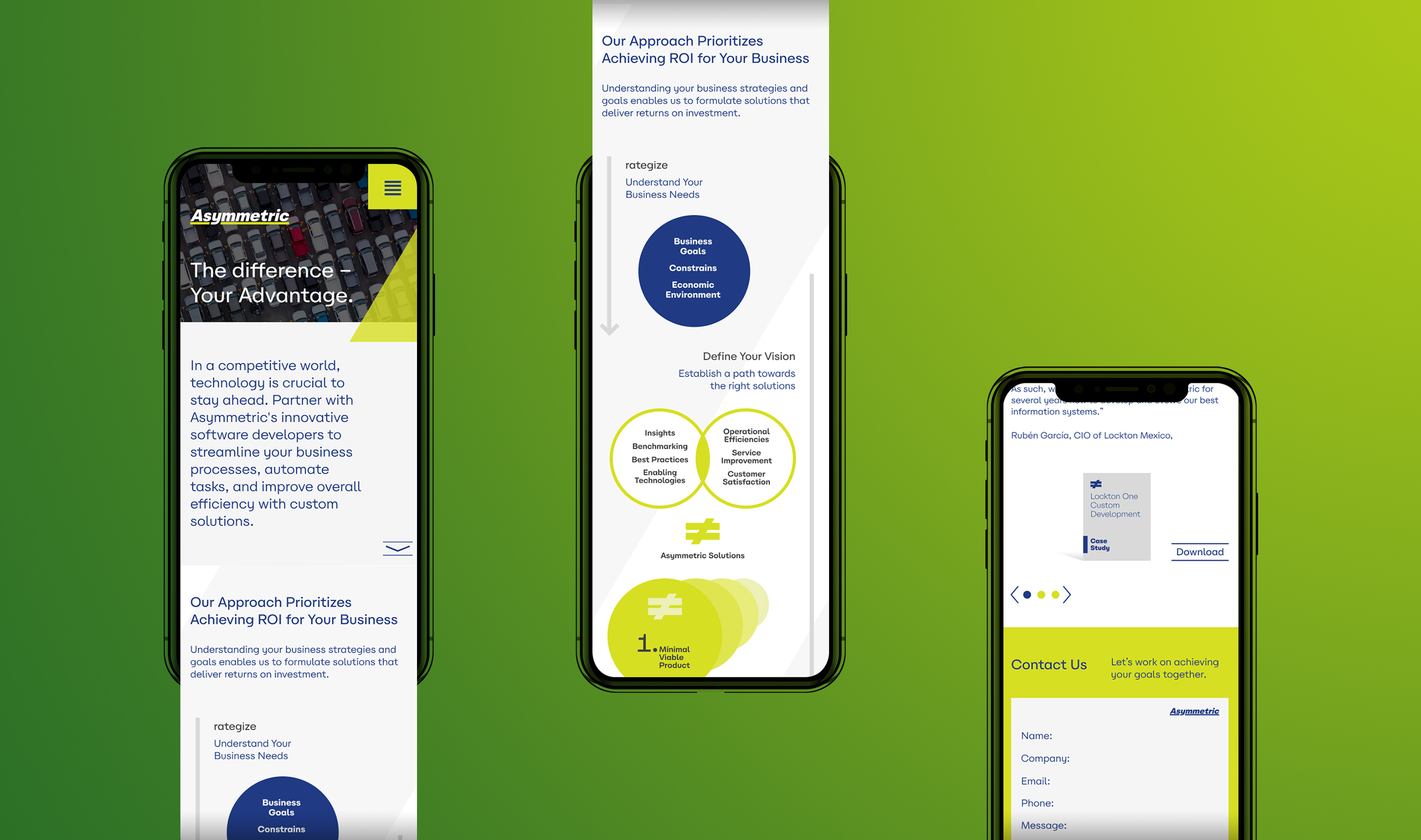
To enhance the new brand identity, we carefully curated a vibrant colour palette, selected relevant stock imagery, and revitalized the company's website to drive business growth.
asymmetric.biz
Read Less
